The Straight Poop About Pump-Out Icons
Your Tax Dollars Once Again Hard at Work
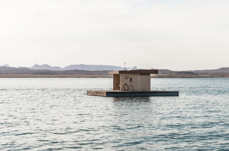
Although it never has been proven that recreational boaters significantly contribute to the water pollution problem, the law mandates that our vessels be saddled with smelly, gross holding tanks or waste treatment plants that have the reliability of a 1970’s Fiat. Although fish, mammals, waterfowl and other aquatic wildlife (which expel far more sewage than boats, by the way) can pee and poop at will directly into the water, boatsmen must carry their waste around with them like it is some kind of sacred treasure. Finding a place to pump out these dreaded tanks is a real problem since pump-out stations are few and far between.
Your Government to the Rescue
But hope is in sight friends. The Feral er... Federal Government is on the case armed with your tax dollars. Some 3,000 pump out stations are expected to be on line by 1998 (that’s 3,000 stations to service a couple of million boats – only 666 boats per station).
The Fish and Wildlife Service (FWS) presently has its snout in a trough containing 30 million taxpayer dollars – the purpose of which is to encourage states to build pump-out stations. Of course, pump-out stations need to have a logo – everything has logos nowadays. Logos are very trendy – very in – fueled, I suspect, by the fact that the percentage of the population in the United States that can’t read English is increasing rapidly. This is the story of how our wonderful, new sewage pump-out logo came to be (I must tell you here that I am making none of this up).
Dirty Pictures
The easy, obvious route to a logo would have been to adopt the pump-out logo that has been used around the world for about 20 years. It was devised by the ISO (International Standards Organization) marine head committee. The IMO symbol was simply a plumbing trap penetrating the deck of a boat – simple and straightforward and, most importantly, already in existence. That logo was immediately rejected out of hand by the FWS. Some – probably a group of blue haired ladies from Topeka – thought it looked “dirty.” Others thought it looked like dancing worms and the FWS no doubt feared that boaters might mistake it for a bait station or, possibly, a worm nightclub! And so, the quest for a “proper” logo became the crusade of Mr. Robert Pacific, Pump Out Program Administrator (POPA) for the FWS (FWS really stands for “Foolish Waste of Shekels”).
Mr. Pacific’s logo pursuit started in April 1993 with what was called a “scope meeting” to discuss the very important new symbol. Attending were representatives from: two states, four marine industry and pleasure boat groups and not one, not two but five federal agencies.
Initially, Mr. Pacific had the logical idea of using the magenta circled “P” depicting pump-out stations that was already adopted on NOAA charts for many years. But – get this now – federal highway officials were afraid that boaters would confuse it with a symbol for parking. Parking! Now, seriously, folks, would any self-respecting boater seeing a big pink “P” inside a circle at a dock really think it was an invitation to “park” there? Since when does anybody “park” boats anyhow? Or, did the highway officials figure that eagle eyed motorists would, somehow, see the sign from the road, drive down the dock and park?
Bubba Couldn’t Make It
And so, more scope meetings were held and then “focus groups” were organized in cities like Annapolis, Miami, Minneapolis and Seattle. These focus groups included boaters, marina owners, state boating administrators, representatives from the International Standards Organization, the American National Standards Institute and American Boat and Yacht Council (President Bubba regretted that he couldn’t attend). GET A LIFE PEOPLE!
A marine consultant named Neal Ross became involved who, apparently, is in the business of giving marine seminars. During his seminars, Mr. Ross submitted different logo designs and straw polls were taken. In all, around sixty logo ideas were considered and rejected. They all had a common theme: usually involving a box (tank) and an arrow. Finally, after all the meetings and all the seminars and all the pious discussions a new logo was selected showing, guess what, essentially a pipe penetrating the deck of a boat – virtually the same as the IMO logo.
Some comments about the new symbol: isn’t this new logo sexist? The arrow is the international symbol for “male” – what will “Boating for Women” think about this? Personally, I think the logo looks like a boat with an engine and a dry stack exhaust going through the top of the house. Hell, won’t people think that only boats with dry stack exhausts can “park” at the sign?
Defining the Logo
Anyway, the new symbol was selected. This should be the end of the story, right? Well... not quite. It seems that the FWS in its infinite wisdom figured that boaters would not able to decipher the new logo so marina owners are encouraged to accompany the logo with a big sign stating “PUMP OUT STATION!” Now it seems to me we could have just used a sign saying “PUMP OUT STATION” from the very beginning and left it at that – probably saving ten million logo dollars in the process. After all, signs on docks that read “gas” or “diesel” or “supplies” have been around since the inception of boating and we got along – sans logos – just fine.
Knowing the political correctness fixation of this country, I am sure that the government will also mandate that “PUMP OUT STATION” be written in four or five different languages – Spanish, German, French, Japanese and Canadian would be good (the Canadian sign would read “Pumpewt Station”). Additionally, there is an official logo slogan that goes like this: “Keep our water clean – use pump-outs.” Very clever – I wonder how many committees and dollars it took to come up with this gem of wisdom. So, now, in addition to the logo, 2 damn signs are posted at each pumpout station. Finally, an international publicity campaign will, hopefully, indoctrinate boaters as to exactly what the logo and new sign mean.
And so, friends, the next time you are thinking of dumping your holding tank into the bay, just reflect on the thought and toil and sweat (not to mention many of your tax dollars) that went into our new pump-out logo. If you can find a pump-out station, use it. Otherwise, pack up your waste, take it home with you and dump it down the toilet. It will, in many cases, wind up back in the bay you were just cruising in!
The problem here, of course, is that when a government agency has 30 million dollars available to spend, it, by God, will be spent whether it needs to be or not.
Many happy pump-outs, friends.
(Reprinted with permission of Regina Fexas.)
If you would like to read more of Tom's pearls of wisdom, tune in next Friday -- "Fexas Friday."
Better yet, why not get a full dose of infectious Fexas whenever you need it -- and buy one of the volumes below. Better yet, why not buy all of them -- we call them the "Fexas Five." They will provide many evenings of fun reading (better than Netflix), and you'll make the widow Regina very happy knowing that Tom will live on with you the way most of us remember him.
Order 1, 2 or "The Fexas Five" --

To find the "Fexas Five" on Amazon, click here...
Tom Fexas (1941-2006) was one of the most influential yacht designers of the last quarter of the 20th century. With the narrow Wall Street commuters that were built in the 1920s and '30s always on the back of his mind, he wanted to design boats that were at once fast, comfortable, seaworthy and economical to operate. Over the years, he and his firm designed over 1,000 yachts for some of the most prestigious boat builders in the world, including Choey Lee, Palmer Johnson, Grand Banks, Mikelson Yachts, Burger, Abeking & Rasmussen and many others.
Even though toward the end of his career he only designed megayachts and superyachts, including the remarkably influential PJ "Time" in 1987, he is best remembered for his first major vessel in 1978 -- Midnight Lace -- which became a series of 44-52-footers. They were light, narrow, and fast with relatively small engines. He was also influential in the boating community because of the monthly column he wrote for Power and Motoryacht, which began in its very first issue in January 1985.